Autonomous Vehicles
Overview
At my current role, I am exploring a user interface for a route planning tool that helps users match vehicles to operational needs by introducing automation into their workflow. I focus on delivering an intuitive experience and impactful solutions for complex decision-making in dynamic environments. Throughout this project, it has taught me how to challenge design solutions, balance technical trade-offs with user needs, and narrow down design scope.
This project is based on a real project with context and details scrubbed due to confidentiality.

Role:
UI/UX Designer, Task Lead
Tools Used:
Adobe Creative Suite
Figma
Excel, Powerpoint, Visio
Duration:
May 2023 - Present
Scope
(at a high level)
System Needs
(What does the system need to do?)
recommend safe and actionable solutions
alert users to issues that are impacting or could impact safety without overwhelming the user
provide clear visualizations of the vehicle’s environment, next actions, and status
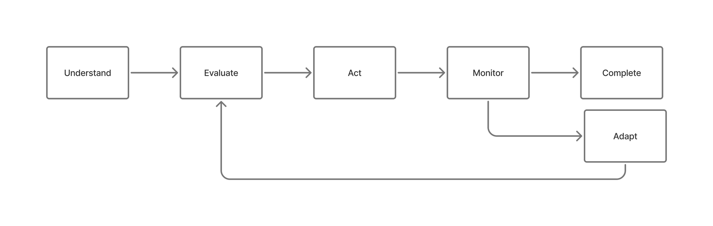
Users
(Who are our users?)
Operational users managing complex autonomous systems.
User Needs
(What do they need?)
to maintain awareness of the status and actions of all their vehicles
to ensure all vehicles are completing their trips safely and efficiently
to quickly resolve vehicle issues as they arise
Design Process
(at a high level)
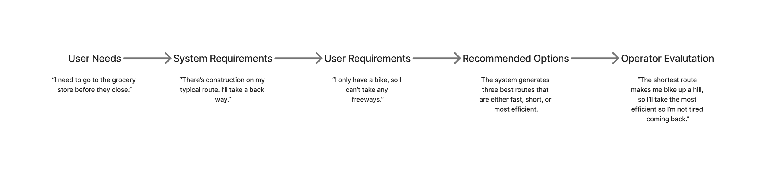
Developing Concepts
Back in May 2023 through most of that summer, it was not uncommon for me to walk around the office with a sketchpad, doodling dozens, if not hundreds, of design concepts that may or may not improve the user’s workflow. At the beginning of the project, we knew users were manually resolving issues within their existing workflow, but we had limited understanding of the underlying pain points.
After initial user engagements, we developed a To-Be workflow that helped us identify opportunities to improve the map interface and overall usability. The initial workflow was clunky and there were plenty of places where pain points were identified. Using this as a tool, I designed more specific design solutions that would improve the map interface and improve system usability for operators. I focused on reducing cognitive load by prioritizing relevant information and familiar design concepts found in everyday life.
Prototyping and Delivery
Taking napkin sketches and developing them into high fidelity mockups didn’t happen overnight.
The middle part was quite fuzzy — we had all these great ideas, but would run into snags that were called out by our internal team, users, and external developers.
“The system can’t quite provide that.”
“It solves the initial problem, but creates a new, more complicated issue.”
“It has too many clicks.”
All this critique would be scary for those in a two week sprint, but that was not the case for this project. We didn’t need to work in two week sprints at the time, which led to better and more comprehensive design. We had every solution and design option under the sun to push and pick on. “How could we make this better?” “What else is this solving?” “What is it making harder?” Asking all these questions and receiving constructive critique wholeheartedly improved the team’s understanding of the problem, current and future workflow, and the design we’re pushing towards.
Now, we follow a sprint drumbeat and deliver design recommendations to the various development teams. Open dialogue between all the teams has been paramount to the success of the project and improvement of design.